In machine learning, optimization of the results produced by models plays an important role in obtaining better results. We normally get these results in tabular form and optimizing models using such tabular results makes the procedure complex and time-consuming. Visualizing results in a good manner is very helpful in model optimization. Using the PyCaret library, we can visualize the results and optimize them. In this article, we are going to discuss how we can visualize results from different modelling procedures. The major points to be discussed in the article are listed below.
Table of contents
What is PyCaret?
Visualizing a classification model
Visualizing a regression model
Visualizing a clustering model
Visualizing anomaly detection
What is PyCaret?
In one of our articles, we have discussed that PyCaret is an open-source library that helps us in performing a variety of machine learning modelling automatically. This library aims to make the process of machine learning modelling simple using a low code interface. Along with such a low code interface, this library provides modules that are very efficient and low time-consuming.
To improve the explainability and interpretability of the process this library provides various visualizations implemented using some of the modules. This library combines visualization from various famous packages like yellowbricks, autovig, plotly, etc. in this article using visualization modules from the PyCaret we are going to plot results from the different models.
Let’s start with a classification model.
Visualizing a Classification model
Let’s start the procedure by importing data. Since we have multiple datasets in the PyCaret library, we can utilize them for practice purposes. In this article, we are going to use a heart disease dataset that has multiple values related to medical conditions that classify whether a person can have heart disease or not. Let’s import it directly from the library. from pycaret.datasets import get_data data = get_data('heart_disease')
Output:

Here in the above output, we can see some of the values from the dataset. Now let’s set up a model.from pycaret.classification import * model1 = setup(data = data, target = 'Disease')
Output:
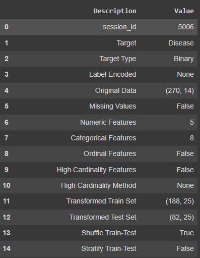
In the setup of the model, we have provided the name of the dataset and the name of the target variable. After optimizing the dataset, the setup module has provided information about the variables that the dataset consists of.
Let’s fit the model.random_forest = create_model('rf')
Output:

Here we can see the information about the accuracy and AUC scores of the model. Hereafter fitting the model, the main purpose of the article comes into the picture.
Visualizing results
One more thing that is great about the PyCaret library is that we can utilize its features for visualizing the results from the model that we have in tabular form.
Plotting the AUC scores:
plot_model(random_forest, plot = 'auc')
Output:

Here in the plot, we can see that we have a detailed visualization of AUC values from the model. There are various libraries like yellowbricks and autovig that help PyCaret to make such visualizations.
Let’s see the confusion matrix in a visualized form.
plot_model(random_forest , plot = 'confusion_matrix')
Output:
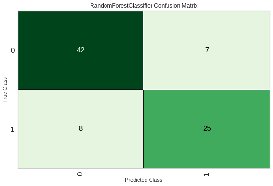
Here we can see the confusion matrix. We can also convert values under the confusion matrix in the percentage.
plot_model(random_forest , plot = 'confusion_matrix', plot_kwargs = {'percent' : True})
Output:

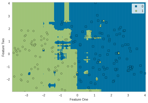
We can also plot results based on the training data by just passing use_train_data as True. Let’s plot the decision boundary of the model.
plot_model(random_forest, plot = 'boundary', use_train_data = True)
Output:
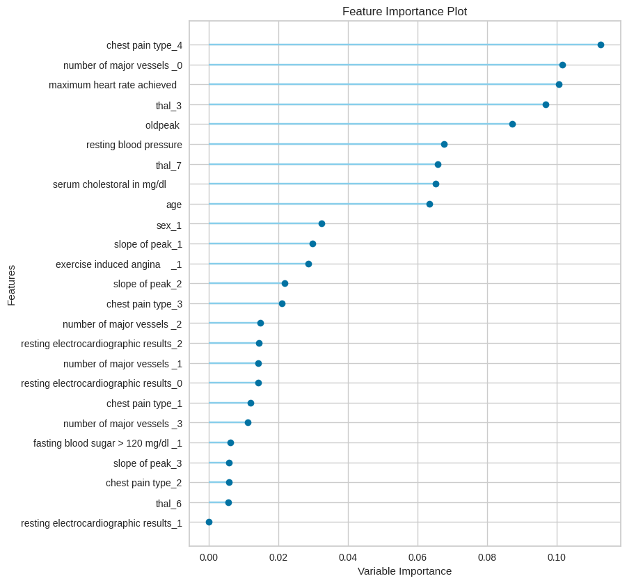
Feature engineering plays a crucial role in data modelling. We can check the feature importance using the following lines of codes.
plot_model(random_forest, plot = 'feature_all', use_train_data = True)
Output:
Here we have discussed the visualization of results by a classification model. We can also plot various results from a regression model.